Go to section
Sponsor
![]() Flow - 4x faster than typing
🎤 Dictation
Flow - 4x faster than typing
🎤 Dictation
The front page of AI.Used by 90M+ humans.

Generate image
Tasks
Generate text
Free mode
Trending
Leaderboard
Characters
 Mini tools
New
Featured
Lists
Agents
Requests
Jobs
Map
Newsletter
Starter pack
Free tools
Speech to text
Text translator
Remove background
Settings
Edit profile
My tools
Gallery
Dashboard
Inbox
Get featured
Contact TAAFT
For you
Popular
Job impact index
Most saved
Affiliate program
Submit AI tool
Notification preferences
Glossary
Home
Timeline
My profile
Create tool
Deals
Companies
Models
Robots
Papers
Fundraises
Repositories
Devices
Organizations
Events
Prompt Pack
Merchendise
APIs
Features
Tools
Countries
Collections
Videos
Mini tools
New
Featured
Lists
Agents
Requests
Jobs
Map
Newsletter
Starter pack
Free tools
Speech to text
Text translator
Remove background
Settings
Edit profile
My tools
Gallery
Dashboard
Inbox
Get featured
Contact TAAFT
For you
Popular
Job impact index
Most saved
Affiliate program
Submit AI tool
Notification preferences
Glossary
Home
Timeline
My profile
Create tool
Deals
Companies
Models
Robots
Papers
Fundraises
Repositories
Devices
Organizations
Events
Prompt Pack
Merchendise
APIs
Features
Tools
Countries
Collections
Videos

▼ Top rated
Visualisations
Free mode
100% free
Freemium
Free Trial
Featured matches
-
-

 Giuseppe🙏 1 karmaMay 20, 2026@Exmergo VizViz makes the process of turning data into dashboards feel much simpler and more natural. Being able to upload or connect data, ask questions in plain language, and quickly get interactive visualizations is genuinely useful, especially for people who do not want to spend hours building dashboards manually. What I like most is that Viz feels focused: it is not just an AI chat tool, but a product designed to help users move from raw data to clear, shareable insights. Overall, it looks like a practical and intuitive tool for making data analysis faster and more accessible.
 -
-

-

-

-
-

Other tools
-
-
I really gotta let my heart out, got so many great reviews from my peers. It has helped me make my school work so much easier. I work with little children so when i make it cartoonish it's giving me the best one's yet.
-
-
 AI-powered microscope for ultra-realistic nano-visuals.Open
 - Sponsor
 Flow - 4x faster than typing🎤 Dictation
 -
Hi Taaft community! I’m the creator of ConceptViz. We built this tool specifically for educators and researchers who deal with complex information daily. ConceptViz uses AI to instantly transform dense lesson plans, curriculum notes, or research frameworks into clear, structured diagrams. Our goal is to help K12 teachers make abstract concepts tangible for students and to help researchers map out logical workflows without the manual drudgery of drawing. I’d love to hear how this fits into your academic or classroom workflow—your feedback will help us build a better tool for the education community! 🚀
-
The infographic maker lets you use it once for free without signing in. This infographic maker is simple and easy to use, even more so than Canva or Venngage. However, the available styles and templates are still limited. I hope they add more design options and customization in future updates. Overall, a good choice for quickly creating infographics.
-
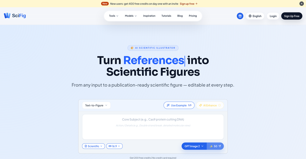
 AI-powered scientific illustration and data visualization platform.Open
 -
-
- Didn't find the AI you were looking for?
-
I felt there is need of more ready made templates. But, it does what it claims. I chose one question suggested by the AI agent, and it created the infographics in few seconds. It's cool. Saving it for future reference.
-
 Open
Open -
 Bring history to life with AI-generated visualizations.Open
 -
 Transform text into surreal pen-and-pencil sketches with watercolor washes.Openhmmm yeah great, i'm sure i could also recreate these in real life, with pencils
 -
-
 AI-generated Indian deity avatars blending tradition with modernity.Open


