

▼ Latest
Lucid chart
Free mode
100% free
Freemium
Free Trial
Featured matches
-

-
 illumi 1.0.0 : Building complex deliverables 🧘 Focus Mode: Our power users love Illumi for visual learning and connecting ideas. But as your projects evolve from loose concepts into long-form documents - like that 40-page market expansion report - the visual noise of a whiteboard can become a distraction. We built Focus Mode to give your ideas the space they deserve. Why Fullscreen on a Whiteboard? When it's time to stop planning and start drafting, expand any card (Notes, Preprints, or Prompts) into a beautiful Fullscreen View. It’s a dedicated text editor living right on top of your visual workspace. 🧠 Gemini 3: Now with Enhanced Web Search We’ve upgraded our integration with Gemini 3 to better harness the live internet. It’s no longer just processing data; it’s actively finding it. Try this prompt: Ask it "What is the biggest news in February 2026?" to see how it pulls real-time, relevant context into your work. ⚡ Speed & "Snappy" Navigation: We’ve overhauled the navigation bar to handle heavy workflows. Instant Loading: Even if you have hundreds of projects, your board list now loads instantly (prioritising your top 15 boards). Seamless Switching: Jumping between whiteboards is now smoother and faster. 🎥 See it in Action: From Solo Progress to Team Momentum Wondering how this fits into your workflow? We’ve put together a walkthrough of a common scenario: The 2-Day Consulting Sprint. 🧨 Lunar New Year Offer: Last Chance! We are preparing to launch our official pricing tiers soon. Sign up before the Lunar New Year to lock in early user benefits!
 -
 Ishan Acharya🙏 1 karmaJan 5, 2026@HemelionI am not sure if its working as when I gave the test and post that when I was trying to pay for the results it failed and is not loading the payment page.
 -
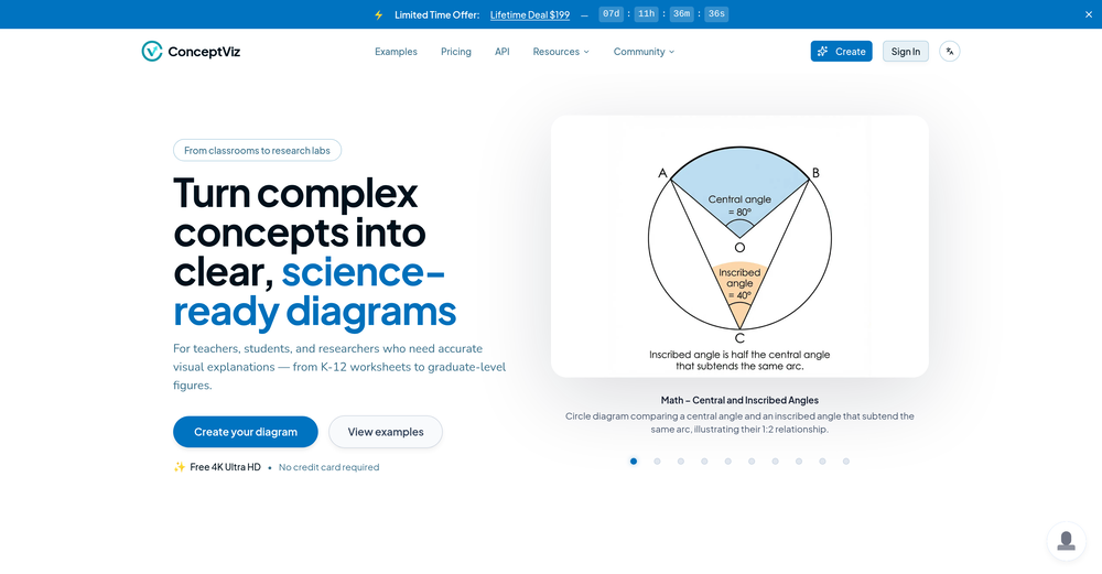 Hi Taaft community! I’m the creator of ConceptViz. We built this tool specifically for educators and researchers who deal with complex information daily. ConceptViz uses AI to instantly transform dense lesson plans, curriculum notes, or research frameworks into clear, structured diagrams. Our goal is to help K12 teachers make abstract concepts tangible for students and to help researchers map out logical workflows without the manual drudgery of drawing. I’d love to hear how this fits into your academic or classroom workflow—your feedback will help us build a better tool for the education community! 🚀
 -


Verified tools
-
I really value the sentiment analysis tool—it simplifies understanding customer feedback by picking up on their emotions. Plus, the way it groups comments into topics is super helpful for decision-making.
- Spotlight:
 TendemTask automation
 -
It works for me, might’ve been a temporary issue. Give it another try!
-
Eh it's ok. You only get one question to test it out and the quality of the info you get in that one message is too lackluster to warrant going back for more, especially if you're into astrology and already know basic stuff. The aesthetic is fine. Some of the buttons are inexplicably disabled and the tooltips conflict with one another on the map, making it irritating to try to interact with the lines rendered on the map.


Other tools
-
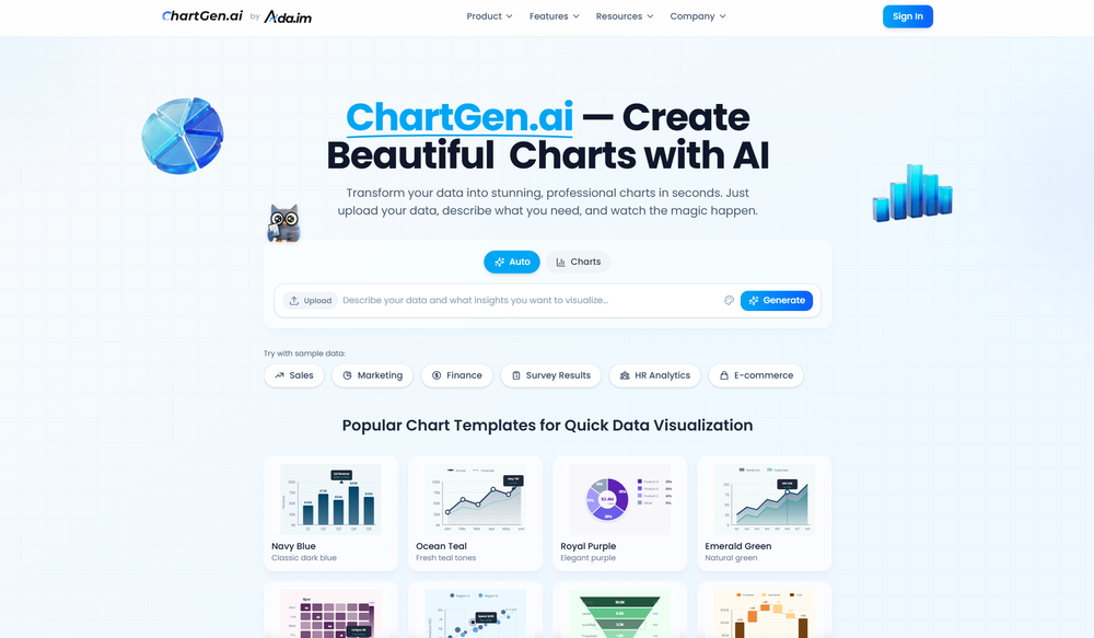
I was just trying to get a quick graph showing population evolution over the last 30 years, didn’t have the dataset ready, so I was hoping the tool could auto-fill something reasonable. But it literally gave me three values. Three?? For 30 years?? What kind of trend can I possibly see with that? If the tool offers to research the data, it should at least offer a full timeline. And when I pasted the data I found, it created a literally bar chart???
-
This one was really nice. In that it could also generate a white paper to go with the diagram
- Didn't find the AI you were looking for?


Post


