
 Turn complex data into clear insights with AI.
vizGPT
Overview
vizGPT is an AI-powered tool focused on data visualization. The tool's primary function is to facilitate the transformation of complex data into clear, insightful visualizations.
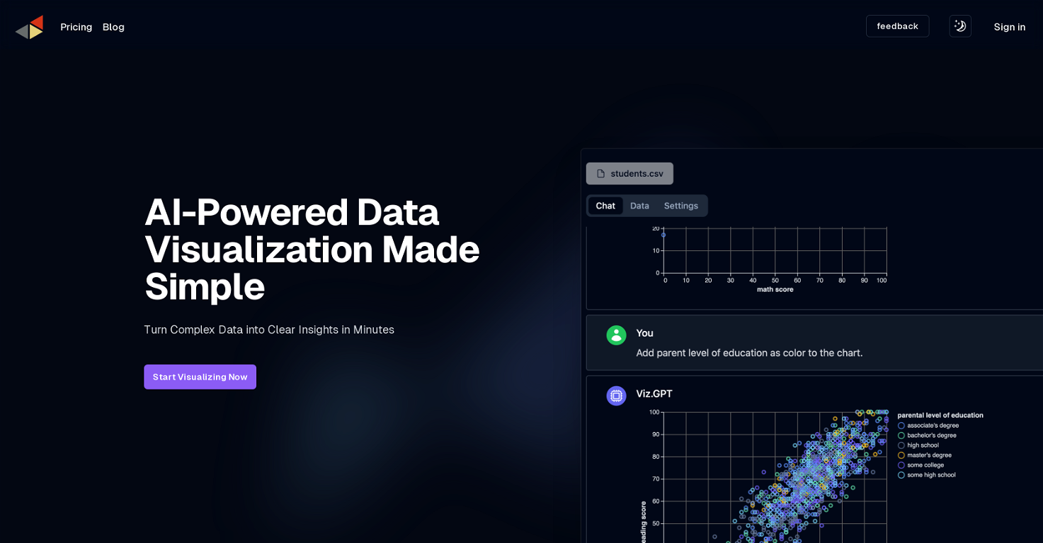
The software's defining feature is its ability to generate visualizations in response to natural language queries, allowing users to interact with their data using plain language instead of dealing with potential syntax errors.
Thanks to its advanced Natural Language Processing (NLP) capabilities, vizGPT makes the entire process of data analysis as straightforward as leading a conversation.
This feature includes real-time responses, which means that users can receive a visualization immediately upon asking a question. Furthermore, vizGPT's AI is designed to remember past queries, enabling a coherent narrative across ongoing data analysis tasks.
In addition to interaction through natural language, vizGPT also offers a no-code, drag-and-drop interface to create visualizations. Another core feature is the Intelligent Data Table that simplifies data transformation and profiling tasks.
The Intelligent Data Table is user-friendly, aiding the users to mold their data as needed. This combination of capabilities makes vizGPT a versatile and inclusive tool, suitable for users regardless of their technical expertise or familiarity with data analysis concepts.
Releases


Pricing
Other tools by Kanaries Data
Top alternatives
-
 Smart insights for business, stunning visuals for creators.Harrison Oliver🙏 24 karmaJun 12, 2025@StatPeckerI felt there is need of more ready made templates. But, it does what it claims. I chose one question suggested by the AI agent, and it created the infographics in few seconds. It's cool. Saving it for future reference.
 -
 Turn raw data into instant visual insights.
 -
 Turn Data into Stunning Charts in SecondsI was just trying to get a quick graph showing population evolution over the last 30 years, didn’t have the dataset ready, so I was hoping the tool could auto-fill something reasonable. But it literally gave me three values. Three?? For 30 years?? What kind of trend can I possibly see with that? If the tool offers to research the data, it should at least offer a full timeline. And when I pasted the data I found, it created a literally bar chart???
 -
 Make Better Decisions with Data-Driven Charts, Clear Explanations, and Insightful Analysis
 -
 Generate visualizations from data using AI
 -
 Supercharge Power BI dashboards with AI-driven insights


