

▼ Popular
Data graph
Free mode
100% free
Freemium
Free Trial
Featured matches
-
-

-
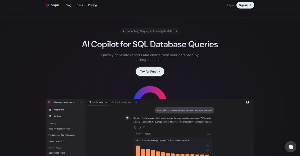
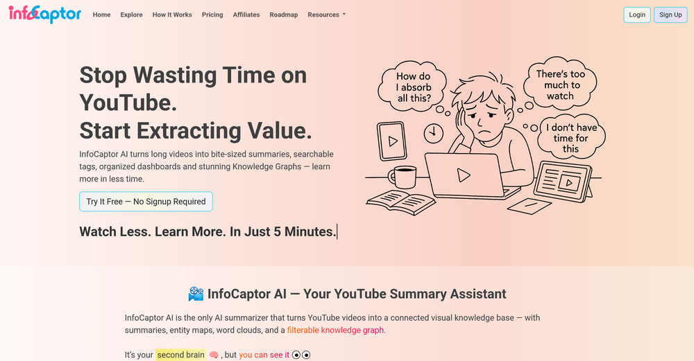 Escapism Records🙏 8 karmaSep 18, 2025@InfoCaptorPretty useful
 -
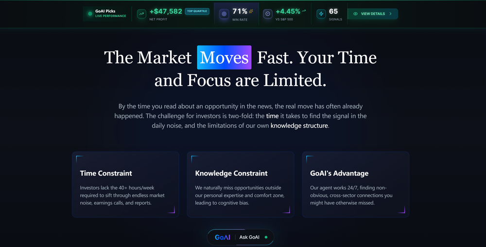 GoAI turns market noise into transparent, actionable investment logic. Go check your favorite stock for an instant deep-dive and see what the AI reveals. Feedback welcome!
 -
Waitlist
 I'm in early beta and I'm managing to orchestrate my 3 openclaw agents with my 2 claude code sessions. It's cool, maybe this is the future.


Other tools
-
-
This one was really nice. In that it could also generate a white paper to go with the diagram
-
-
I can't help but rave about this product because of the level of craftsmanship in it; Vizly is made for data scientists, by data scientists, and it shows. Having tried various tools in the space, I can confidently say it's the best by a mile, the UX is silky smooth and will feel familiar to any data scientist, and yet it manages to supercharge your workflows - I gurantee you'll be a few times more productive, can't recommend it enough.
- Sponsor:
 Nebius Token Factory🧠 AI inference
 -
I wasn't able to use this one (I have my API key)
-
I really value the sentiment analysis tool—it simplifies understanding customer feedback by picking up on their emotions. Plus, the way it groups comments into topics is super helpful for decision-making.
-
I really like DataLine, but I'm kinda biased cause I built it.
-
-
InLinks is absolutely amazing for content optimization, internal linking and schema . I love how it prompts you to optimize for the entities/topics Google recognizes, not just keywords. The internal linking automation saves several hours every month especially with the RSS feed that automatically adds links to your blog as you post new content. All round brilliant tool!
- Didn't find the AI you were looking for?
-
-
Love this!! 100x better than Notion, this should get more attention
-
Great tool for getting some initial information about your data, especially in the beginning phase when your main goal is to explore your data
-
I was just trying to get a quick graph showing population evolution over the last 30 years, didn’t have the dataset ready, so I was hoping the tool could auto-fill something reasonable. But it literally gave me three values. Three?? For 30 years?? What kind of trend can I possibly see with that? If the tool offers to research the data, it should at least offer a full timeline. And when I pasted the data I found, it created a literally bar chart???
-
-
Really good - a bit of a hidden gem this tool. Would recommend to others who struggle.
-
 Open
Open -
 Open
Open -
Dumber than a box of hair. Asked for a break even analysis chart. Fed it clear fixed costs, variable costs, net operating income AND ROI percentages. Even hinted that the break even point was between years six and seven. Dude took five minutes to draw a line across the "0" plane labeled "costs" and a revenue line crossing through where I suggested the break even point is. The scale was between 0.2-1.6 USD. No, I am not running a business for ants.
-
 Expert in explaining data visuals for academic publishing.Open
 -
 Open
Open -
 Open
Open -
 Streamlining development with multi-language support, code execution, and debugging.Open


Post


