Go to section
Sponsor
![]() Flow - 4x faster than typing
🎤 Dictation
Flow - 4x faster than typing
🎤 Dictation
The front page of AI.Used by 90M+ humans.

TAAFT Tutorial
Generate image
Tasks
Generate text
Free mode
Trending
Leaderboard
Characters
 Mini tools
New
Featured
Lists
Agents
Requests
Jobs
Map
Newsletter
Starter pack
Free tools
Speech to text
Text translator
Remove background
Settings
Edit profile
My tools
Gallery
Dashboard
Inbox
Get featured
Contact TAAFT
For you
Popular
Job impact index
Most saved
Affiliate program
Submit AI tool
Notification preferences
Glossary
Home
Timeline
My profile
Create tool
Deals
Companies
Models
Robots
Papers
Fundraises
Repositories
Devices
Organizations
Events
Prompt Pack
Merchendise
APIs
Features
Tools
Countries
Collections
Videos
Mini tools
New
Featured
Lists
Agents
Requests
Jobs
Map
Newsletter
Starter pack
Free tools
Speech to text
Text translator
Remove background
Settings
Edit profile
My tools
Gallery
Dashboard
Inbox
Get featured
Contact TAAFT
For you
Popular
Job impact index
Most saved
Affiliate program
Submit AI tool
Notification preferences
Glossary
Home
Timeline
My profile
Create tool
Deals
Companies
Models
Robots
Papers
Fundraises
Repositories
Devices
Organizations
Events
Prompt Pack
Merchendise
APIs
Features
Tools
Countries
Collections
Videos

▼ Price
Data charts
Free mode
100% free
Freemium
Free Trial
Featured matches
-

-
 neu gls🛠️ 1 tool 🙏 34 karmaJul 10, 2025@RowSpeakTired of wrestling with complex formulas, spending hours cleaning data, and struggling to create the right charts? Excelmatic is a powerful web-based AI agent designed to revolutionize your relationship with spreadsheets.
 -
-
 AI astrology app for birth charts, horoscopes, compatibility, and life timing.Open
-

-

-

-

-
 Edit smarter, faster and easier with Filmora’s powerful AI video tools.Open
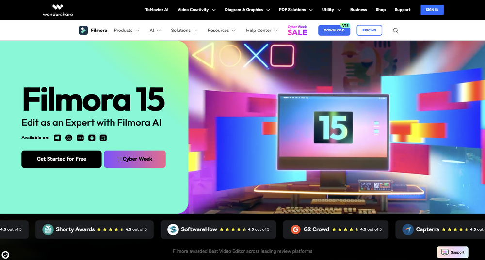
-


Other tools
-
I really like DataLine, but I'm kinda biased cause I built it.
-
 Make Better Decisions with Data-Driven Charts, Clear Explanations, and Insightful AnalysisOpen
 - Sponsor
 Flow - 4x faster than typing🎤 Dictation
 -
Says "free during testing," but keeps telling me I have insufficient credits. I also can't seem to find a way to delete my account.
-
This one was really nice. In that it could also generate a white paper to go with the diagram
- Didn't find the AI you were looking for?
-
 AI-powered project management connecting data, teams and decisions.Open
 -
I really gotta let my heart out, got so many great reviews from my peers. It has helped me make my school work so much easier. I work with little children so when i make it cartoonish it's giving me the best one's yet.
-
I got some free credits to try the app when I signed up, I could create a few great infographics
-
Gatsbi combines AI-driven combinatorial innovation with human-developed TRIZ methodology, making it uniquely powerful for practical applications. Unlike purely research-focused systems, it delivers immediate value through features like automatic patent document generation and academic paper creation. By efficiently navigating vast solution spaces, Gatsbi identifies novel approaches to complex problems while maintaining feasibility. This tool significantly lowers barriers to innovation for organizations without dedicated scientific teams, making cutting-edge research capabilities accessible to more users across all scientific disciplines.
-
 AI-powered scientific illustration and data visualization platform.Open
 -
 AI infographic generator that turns blog posts into link magnetsOpen
 -
-
Looks promising but found it very slow to load and create templates and previews
-
 Open
Open -
Great tool for getting some initial information about your data, especially in the beginning phase when your main goal is to explore your data
-
It's a pity I got a red line saying there is an error Actually, after a while, I got an email with the presentation So it was created, delivery was average I'd say, I didn't use it
-
-
I was just trying to get a quick graph showing population evolution over the last 30 years, didn’t have the dataset ready, so I was hoping the tool could auto-fill something reasonable. But it literally gave me three values. Three?? For 30 years?? What kind of trend can I possibly see with that? If the tool offers to research the data, it should at least offer a full timeline. And when I pasted the data I found, it created a literally bar chart???
-
 Ask data questions, get instant insights, SQL, and charts — all poweredOpen
 -
-
impressive :O quite easy to use and great designs overall
-
-
-
-
 Create stunning hand-drawn flowcharts from text instantly.OpenI use AI Flowchart Generator to create flowcharts for my blog posts. It’s incredibly easy to use and saves me so much time. Now, I can turn my text to flowchart and make my posts more interesting and helpful for readers!
 -
 Ask questions that can be answered by the datasette.io database.Open
 -
 Expert in UK Business & Administrative Studies theses.Open
 -
Dumber than a box of hair. Asked for a break even analysis chart. Fed it clear fixed costs, variable costs, net operating income AND ROI percentages. Even hinted that the break even point was between years six and seven. Dude took five minutes to draw a line across the "0" plane labeled "costs" and a revenue line crossing through where I suggested the break even point is. The scale was between 0.2-1.6 USD. No, I am not running a business for ants.
-
 Open
Open


