What is Columns?
Columns is an AI-powered data visualization and collaboration platform. It allows teams to collaborate in real-time to create visualizations using natural language inputs and speech. It offers fine-grained access controls for users to manage their data catalog. Columns can be accessed through the website or integrated with other tools.
How does Columns use AI?
Columns uses AI to facilitate data visualization and collaboration. AI is used to interpret and react to natural language inputs and speech, making it possible to query and visualize data in real-time.
What is GPT-3 and how is it used in Columns?
GPT-3 is a state-of-the-art AI model, which can understand and generate human-like text based on an input. In Columns, users can chat with GPT-3 to query and visualize data, making data analysis more accessible and interactive.
How does Columns handle data visualization?
Columns facilitates data visualization by allowing users to create visualizations using natural language inputs and speech. It offers a wide range of templates and pre-built tools for creating charts and graphs and includes a library of icons, images, and shapes to aid in data storytelling.
Can you use natural language inputs in Columns?
Yes, natural language inputs can be used in Columns. This feature is made possible by the integration of the GPT-3 model, allowing for an intuitive and user-friendly way to query and visualize data.
What kind of access controls does Columns offer?
Columns offers fine-grained access controls. This allows users to manage their data catalog, providing a secure platform for the protection and controlled access to sensitive data.
What kind of data can be queried in Columns?
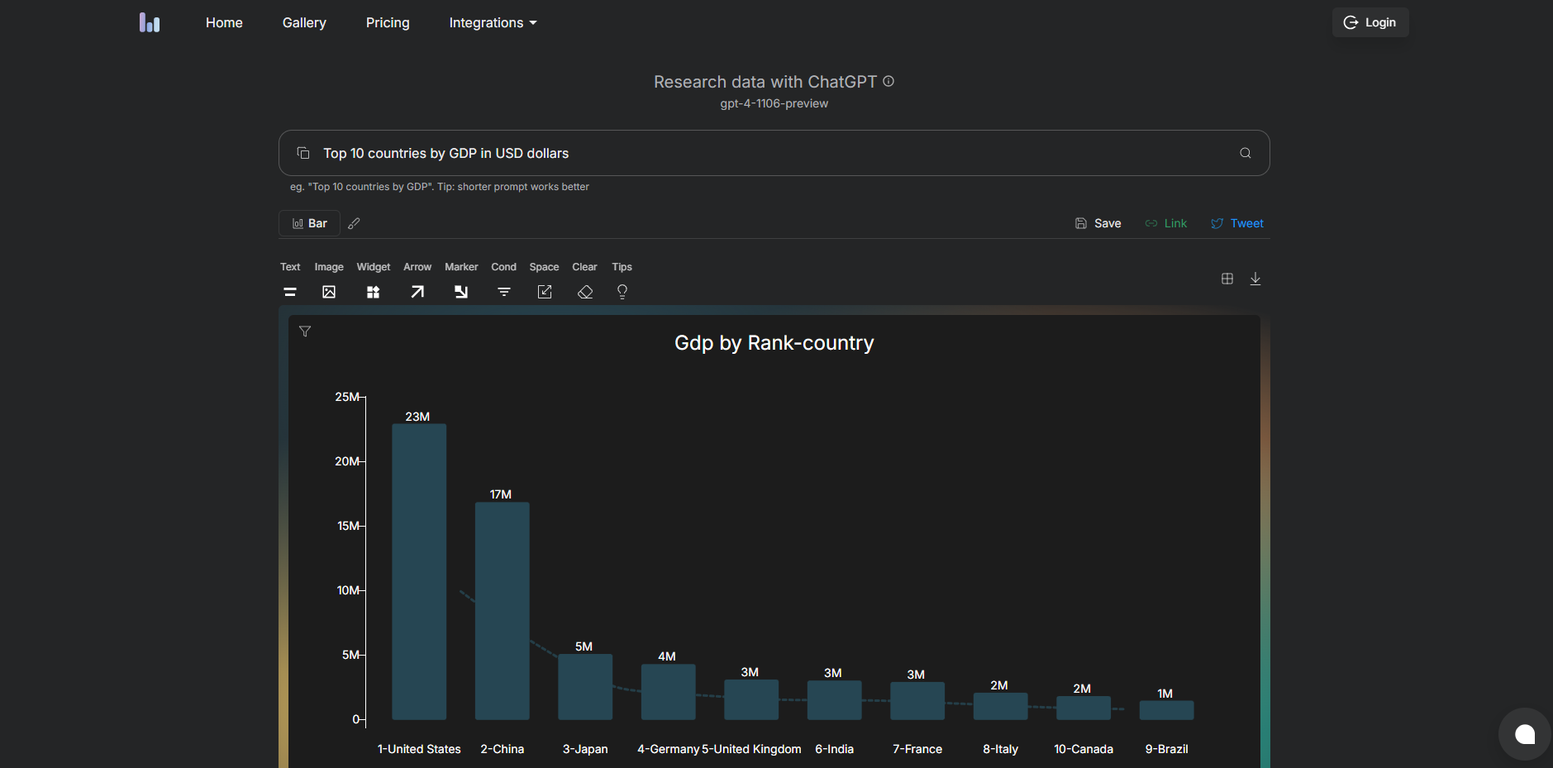
User can query a wide range of data in Columns. Examples of queries could include: top countries by GDP or population, projected electric auto sales by brand, or distance to the sun by planet. The data available for queries will depend on the datasets integrated in the user's tool.
What templates and tools does Columns offer for creating charts and graphs?
Columns offers a wide range of templates and pre-built tools for creating charts, graphs, and visualizations. This makes the data visualization process easier and faster, and lets users focus on data analysis and interpretation.
What types of charts can be made using Columns?
Users can make various types of charts using Columns, including bar charts, line charts, scatter plots, among others. The platform provides templates for these types of charts to further streamline the creation process.
How is Columns integrated with other tools?
Columns is integrated with other tools like Slack and GitHub. This makes it easy to collaborate, share insights, and manage data across different teams and platforms. The specific functionality of the integrations can vary depending on the requirements and workflows of individual teams.
How does Slack integration work with Columns?
The Slack integration with Columns facilitates real-time collaboration and sharing of insights across teams. For example, you can send data visualizations directly to Slack channels or individual members, and they can respond and engage with the data from within the Slack environment.
What is the role of icons, images, and shapes in Columns?
Icons, images, and shapes in Columns are tools for users to create visually appealing and informative data stories. They add aesthetic value and meaning to data visualizations and make them more comprehensible and engaging for the audience.
What does Columns mean by self-serve data storytelling?
Self-serve data storytelling in Columns refers to the ability of users to independently create their own narrative using data. It's about being able to query, visualize, interpret, and share data, all within the platform without the need for extensive technical knowledge.
How is Github used with Columns?
Github is used with Columns to facilitate code and data sharing within a team. It can also serve as a data source that can be visualized using the Columns platform.
How to manage data catalog in Columns?
Users can manage their data catalog in Columns using the fine-grained access controls offered by the platform. This allows them to control who can access the data and prevent unauthorized access.
What data visualization options are available on Columns?
Data visualization options available on Columns include a range of charts and graphs, like bar charts, line charts, scatter plots, and more. In addition, it offers features like a library of icons, images, and shapes to enhance the visualizations.
What are the JavaScript requirements for using Columns?
Columns app requires the ability to process javascript to function properly. Users would need to have a javascript-enabled browser to access and use all the features of Columns.
How can I use Columns to share insights with my team?
You can share insights with your team using Columns through its collaborative features and integrations with different tools. It facilitates simultaneous real-time work on visualizations and allows users to share their work directly through platforms like Slack.
How does Columns use speech for data visualization?
Columns incorporates speech recognition technology, allowing users to engage the system using spoken commands or queries. It's an intuitive feature that makes interaction with data seamless and user-friendly.
Why would a team use Columns for data visualization and collaboration?
Teams would use Columns for data visualization and collaboration because it combines the power of AI with user-friendly tools to facilitate the creation of visually appealing and informative data stories. With real-time collaboration features, integrations, and fine-grained access controls, it streamlines data management and decision-making processes across teams.