Go to section
Sponsor
![]() Flow - 4x faster than typing
🎤 Dictation
Flow - 4x faster than typing
🎤 Dictation
The front page of AI.Used by 90M+ humans.

TAAFT Tutorial
Generate image
Tasks
Generate text
Free mode
Trending
Leaderboard
Characters
 Mini tools
New
Featured
Lists
Agents
Requests
Jobs
Map
Newsletter
Starter pack
Free tools
Speech to text
Text translator
Remove background
Settings
Edit profile
My tools
Gallery
Dashboard
Inbox
Get featured
Contact TAAFT
For you
Popular
Job impact index
Most saved
Affiliate program
Submit AI tool
Notification preferences
Glossary
Home
Timeline
My profile
Create tool
Deals
Companies
Models
Robots
Papers
Fundraises
Repositories
Devices
Organizations
Events
Prompt Pack
Merchendise
APIs
Features
Tools
Countries
Collections
Videos
Mini tools
New
Featured
Lists
Agents
Requests
Jobs
Map
Newsletter
Starter pack
Free tools
Speech to text
Text translator
Remove background
Settings
Edit profile
My tools
Gallery
Dashboard
Inbox
Get featured
Contact TAAFT
For you
Popular
Job impact index
Most saved
Affiliate program
Submit AI tool
Notification preferences
Glossary
Home
Timeline
My profile
Create tool
Deals
Companies
Models
Robots
Papers
Fundraises
Repositories
Devices
Organizations
Events
Prompt Pack
Merchendise
APIs
Features
Tools
Countries
Collections
Videos

▼ Popular
Data-visualization
Free mode
100% free
Freemium
Free Trial
Featured matches
-
 The fastest way to map and streamline inefficient workflowsOpen
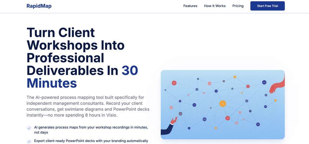 Michael Adair🙏 5 karmaDec 1, 2025@RapidMap - powered by LeanifyVery good. I like it
 -
-
 Tired of wrestling with complex formulas, spending hours cleaning data, and struggling to create the right charts? Excelmatic is a powerful web-based AI agent designed to revolutionize your relationship with spreadsheets.
 -

-
 Thanks for your feedback! We are also shipping some exciting new features this month!
 -
-
-

-
-


Other tools
-
Being able to tell it to create an app for anything I want - for myself or for the AI to use is the coolest thing!
-
i would say it gives the mind a sense of clarity
-
 Automate data work and reporting with AI Agents. No data|coding skills required.OpenSigned up for a pro account for Google Drive integration. Works great! Saves me a lot of manual excel work.
 -
This one was really nice. In that it could also generate a white paper to go with the diagram
- Sponsor
 Flow - 4x faster than typing🎤 Dictation
 -
I had to tweak a few things to match my brand style, but overall it saved me a ton of time. Definitely handy if you need something fast and professional-looking.
-
This has got a super-positive future. After creating just one video, I could see that there would be a large use-case for most industries, including mine with Online Marketing. One thing I did notice was that assets that appear on screen often overlap each other. The same was apparent on most of the other videos in their showcase. Once they get over this hurdle, it'll be worth paying for, for sure.
-
-
-
How has this not received a single review. It’s a brilliant analytical writer of up to 5,000 words
-
Great tool, offers a lot of data story suggestion and detailed charts.
-
 Ask data questions, get instant insights, SQL, and charts — all poweredOpen
 - Didn't find the AI you were looking for?
-
-
Every claim on this site starting with #1 Free use as many times as you like is false. Dont waste your time! "https://imagetovideoai.run/#:~:text=1,as%20you%20need.
-
At the moment it works for me, perhaps try again?
-
-
-
It’s a powerful and intuitive tool that simplifies complex tasks, boosts productivity, and makes managing work smoother than ever. Highly recommended!
-
-
 Create stunning hand-drawn flowcharts from text instantly.OpenI use AI Flowchart Generator to create flowcharts for my blog posts. It’s incredibly easy to use and saves me so much time. Now, I can turn my text to flowchart and make my posts more interesting and helpful for readers!
 -
 AI-powered analytics that unlock smarter business insights.OpenI used Analytify and found it incredibly easy to set up and integrate with Google Analytics, giving me real-time stats and page-level insights without needing any coding knowledge.
 -
I felt there is need of more ready made templates. But, it does what it claims. I chose one question suggested by the AI agent, and it created the infographics in few seconds. It's cool. Saving it for future reference.
-
The leading generative media models on fal combined with top-earning real-world creative talent on Contra is a powerful combination. Feedback to fuel the future of creative ai.
-
Google Earth AI embraces a plethora of tasks. It helps in visualizing geographic data, guides in making advanced data mapping, and supports in 3D earth modeling. It also provides a platform for location-based services and remote sensing, while incorporating satellite imagery for detailed geospatial analysis.
-
-
It's a pity I got a red line saying there is an error Actually, after a while, I got an email with the presentation So it was created, delivery was average I'd say, I didn't use it
-
Didn't really do the graphs that i thought it would do. Good for simple graphs, like for a presentation
-
-
Hi Taaft community! I’m the creator of ConceptViz. We built this tool specifically for educators and researchers who deal with complex information daily. ConceptViz uses AI to instantly transform dense lesson plans, curriculum notes, or research frameworks into clear, structured diagrams. Our goal is to help K12 teachers make abstract concepts tangible for students and to help researchers map out logical workflows without the manual drudgery of drawing. I’d love to hear how this fits into your academic or classroom workflow—your feedback will help us build a better tool for the education community! 🚀
-
 AI infographic generator that turns blog posts into link magnetsOpen
 -
 Make Better Decisions with Data-Driven Charts, Clear Explanations, and Insightful AnalysisOpen
 -
-
I was just trying to get a quick graph showing population evolution over the last 30 years, didn’t have the dataset ready, so I was hoping the tool could auto-fill something reasonable. But it literally gave me three values. Three?? For 30 years?? What kind of trend can I possibly see with that? If the tool offers to research the data, it should at least offer a full timeline. And when I pasted the data I found, it created a literally bar chart???
-
I’d say this is one of the best chatbots I’ve used so far. The side-by-side comparison view is super handy for spotting bias and made-up, and the custom bots actually have decent memory, which is rare. Just a heads up: no image generation or voice mode. Other than that, it’s pretty solid.
-
Created a dashboard using my Excel file and it gave insights I didn’t even expect. It can read any kind of Excel file no matter the template. I can even check the accuracy by tracing back which column the data came from Great tool. highly recommended!!
-
The conversation with the ai felt really nice. And the even the narrative part is well executed.
-
-
The infographic maker lets you use it once for free without signing in. This infographic maker is simple and easy to use, even more so than Canva or Venngage. However, the available styles and templates are still limited. I hope they add more design options and customization in future updates. Overall, a good choice for quickly creating infographics.
-
 OpenReally great number pattern generator. We have taken your tool and made some advanced changes here - https://texttoolz.com/tools/number-pattern-generator
 -
It can only capture a box in a page, but if the page is longer than the screen, and it has scrolling text, the tool cannot handle it wholly. Then the user has to scroll and do the job piece by piece, making this extension useless. I have also encountered several issues with extracting data from a web page with tables and pasting it onto an Excel file, the formatting was not kept and I have spent hours on portions of the texts just to be able to paste it into an excel file correctly. This last issue might be due solely to the web page I have tried the extension on, but the fact that the tool cannot capture the whole page, still stands.
-
Create and share Mermaid diagrams instantly in your browser
-
It greatly supported my R&D work by helping me tackle technical challenges and prepare reports.
-
Says "free during testing," but keeps telling me I have insufficient credits. I also can't seem to find a way to delete my account.
-
I'm absolutely blown away by the design quality of the presentations they look so vibrant and stylish. I was also pleasantly surprised that the AI asks lots of clarifying questions to make sure the final result is exactly what I wanted, not just something random. Vibes 🔥
-
 Stand out and win more clients with personalised AI recommendationsOpen
 -
-
I've been using Basquio as alpha tester and saved around 10 hours a week when doing slides since I started. My team at loamly.ai uses daily now. The depth of the analysis, as specialised agent is really impressive
-
Really loved the concept to try out different databases with the Agent
-
 Turn notes into perfect infographics from 500+ designs.OpenHi TAAFT! I'm Henry, the founder of CartoMind. CartoMind offers a fully automated AI workflow to help you quickly organize text content and generate the perfect infographics to match. 【Why did I build this?】 When creating infographics with AI today, users are often forced to choose between two extremes. You either use generic AI image SaaS tools that trap you in complex prompt engineering and steep design learning curves with zero knowledge management, or you use products like NotebookLM. While they are fantastic for knowledge management, their infographic generation is just an afterthought, lacking design freedom and rich templates. 【Here is where CartoMind stands out:】 1. Lightweight knowledge & note management: We support uploading multiple file formats and automatically parsing text, allowing you to freely select the exact knowledge snippets you want to visualize. 2. Fully automated workflow: Based on your selected content, our AI automatically distills the key text elements and instantly matches you with the ideal infographic design from over 500 professional combinations. 3. Massive template library: A rich selection of infographic templates offering a true what-you-see-is-what-you-get experience. 【Who is using it?】 Marketers, educators, social media creators... In fact, anyone who needs to make their domain knowledge "visible" and loves to share it will find it incredibly useful. 【I can't wait for you all to try it out!】
 -
I got some free credits to try the app when I signed up, I could create a few great infographics
-
-
 AI-powered project management connecting data, teams and decisions.Open
 -
As a tattoo nerd who cares about solid guidance and clean cover-ups, this one is a surprisingly good jump-ogg. Great for "what can I make here" and getting three or four workable angles to bring to the shop.
-
RenderCAD has been such an incredible asset to my company, At Home By Design. We specialize in both commercial and residential design, and their renderings have truly brought my visions to life. The level of detail, professionalism, and presentation has been beyond impressive.
-
 10X AI Adoption with Your Change Management Copilot; for digital transformation consultantsOpen
 -
I really gotta let my heart out, got so many great reviews from my peers. It has helped me make my school work so much easier. I work with little children so when i make it cartoonish it's giving me the best one's yet.
-
Viz makes the process of turning data into dashboards feel much simpler and more natural. Being able to upload or connect data, ask questions in plain language, and quickly get interactive visualizations is genuinely useful, especially for people who do not want to spend hours building dashboards manually. What I like most is that Viz feels focused: it is not just an AI chat tool, but a product designed to help users move from raw data to clear, shareable insights. Overall, it looks like a practical and intuitive tool for making data analysis faster and more accessible.
-
OtterQuant provides natural language stock screening, AI analysis and alternative market data like congress trade tracking.
-
 AI-powered scientific illustration and data visualization platform.Open
 -
I run an early-stage startup. Arka has been pretty amazing for understanding our user adoption data (and then be able to ask follow up questions) in just a few clicks!
-
-
I did not like it. Seems very generic and did not adapt or recognized the topic to change the figures and the templates. Simply put my text to templates not related to the topic.
-
-
-
 AI-accelerated climate digital twin for global weather simulation.Open
 -
 Generate stunning AI images of futuristic musical idols.Open
 -
 Open
Open -
 Generate ultra-realistic satellite images with professional detail.Open
 -
 Open
Open -
 Bring history to life with AI-generated visualizations.Open
 -
 Open
Open -
 Transform molecular visualization requests into precise PyMOL commands.Open
 -
Dumber than a box of hair. Asked for a break even analysis chart. Fed it clear fixed costs, variable costs, net operating income AND ROI percentages. Even hinted that the break even point was between years six and seven. Dude took five minutes to draw a line across the "0" plane labeled "costs" and a revenue line crossing through where I suggested the break even point is. The scale was between 0.2-1.6 USD. No, I am not running a business for ants.
-
 Expert in explaining data visuals for academic publishing.Open
 -
 Technical expert on Data Visualization and database integrationOpen
 -
 Guides in choosing the right business data visualizations.Open
 -
 Open
Open -
 Open
Open -
 Automatically tile all professionals and equipment.Open
 -
 Create 'Fool Around/Find Out' line charts for your plans.Open


