

▼ Price
Data visualisation
Free mode
100% free
Freemium
Free Trial
Featured matches
-
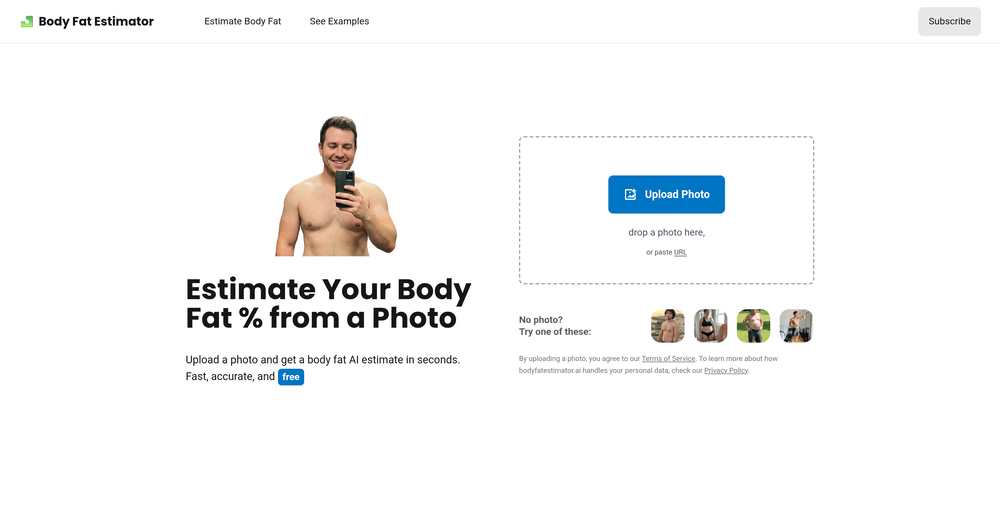 Matt Phelps🛠️ 1 tool 🙏 3 karmaFeb 10, 2026@BodyFatEstimator.aiestimate was in line with a recent DEXA scan
 -
 AI design agent. One photo into complete set of ecom product images+copyOpen
 AI figured out the target audience, product benefits, and visual direction. I just picked an option and got a full gallery. The output is clean, aesthetic, not too AI-ish Would be better if I could upload more than one photo. one image feels a bit limited
 -
 I really gotta let my heart out, got so many great reviews from my peers. It has helped me make my school work so much easier. I work with little children so when i make it cartoonish it's giving me the best one's yet.
 -

-
 Columns Flow: data automation platform built for everyone.
 -
-


Other tools
-
I really like DataLine, but I'm kinda biased cause I built it.
- Sponsor:
 Base44💻 Vibe coding
 -
It's helps you get started on a presentation. Likely need to edit photos and text.
-
I am able to summarize a complex paper into a one-pager visual. Before this tool: hours of reading and summarizing. After this tool: I grasp something complex in seconds. Thank you!!!
-
- Didn't find the AI you were looking for?
-
There is no image to see after giving prompt and generating
-
-
Hi Taaft community! I’m the creator of ConceptViz. We built this tool specifically for educators and researchers who deal with complex information daily. ConceptViz uses AI to instantly transform dense lesson plans, curriculum notes, or research frameworks into clear, structured diagrams. Our goal is to help K12 teachers make abstract concepts tangible for students and to help researchers map out logical workflows without the manual drudgery of drawing. I’d love to hear how this fits into your academic or classroom workflow—your feedback will help us build a better tool for the education community! 🚀
-
-
-
Great tool for getting some initial information about your data, especially in the beginning phase when your main goal is to explore your data
-
Data narration and augmentation are valuable tools from datumfuse.ai
-
It is the ease of use for me. DataSquirrel is fast, the UI is super intuitive, and the guided analysis feature is highly convenient. I have officially moved from uploading CSV files from Google sheet to DataSquirrel. Within minutes, I can visualize my data and interpreting it becomes super simple.
-
Similarity search works okay, but UX could be improved — it's hard to tell when a search was completed. Also there are some minor mistakes in BPM assignation. But overall works as expected and helps finding similar tracks.
-
I was just trying to get a quick graph showing population evolution over the last 30 years, didn’t have the dataset ready, so I was hoping the tool could auto-fill something reasonable. But it literally gave me three values. Three?? For 30 years?? What kind of trend can I possibly see with that? If the tool offers to research the data, it should at least offer a full timeline. And when I pasted the data I found, it created a literally bar chart???
-
asking for key, no usability without a paid subscription
-
-
I felt there is need of more ready made templates. But, it does what it claims. I chose one question suggested by the AI agent, and it created the infographics in few seconds. It's cool. Saving it for future reference.
-
I really value the sentiment analysis tool—it simplifies understanding customer feedback by picking up on their emotions. Plus, the way it groups comments into topics is super helpful for decision-making.
-
-
-
 Guides in choosing the right business data visualizations.Open
 -
 Technical expert on Data Visualization and database integrationOpen
 -
 Open
Open -
 Create 'Fool Around/Find Out' line charts for your plans.Open
 -
 Open
Open -
 Automatically tile all professionals and equipment.Open
 -
Dumber than a box of hair. Asked for a break even analysis chart. Fed it clear fixed costs, variable costs, net operating income AND ROI percentages. Even hinted that the break even point was between years six and seven. Dude took five minutes to draw a line across the "0" plane labeled "costs" and a revenue line crossing through where I suggested the break even point is. The scale was between 0.2-1.6 USD. No, I am not running a business for ants.
-
 Expert in explaining data visuals for academic publishing.Open
 -
 Open
Open -
 NowCast Market Risk From Wallstreet Market News!Open


Post


