Go to section
Sponsor
![]() Flow - 4x faster than typing
🎤 Dictation
Flow - 4x faster than typing
🎤 Dictation
The front page of AI.Used by 90M+ humans.

TAAFT Tutorial
Generate image
Tasks
Generate text
Free mode
Trending
Leaderboard
Characters
 Mini tools
New
Featured
Lists
Agents
Requests
Jobs
Map
Newsletter
Starter pack
Free tools
Speech to text
Text translator
Remove background
Settings
Edit profile
My tools
Gallery
Dashboard
Inbox
Get featured
Contact TAAFT
For you
Popular
Job impact index
Most saved
Affiliate program
Submit AI tool
Notification preferences
Glossary
Home
Timeline
My profile
Create tool
Deals
Companies
Models
Robots
Papers
Fundraises
Repositories
Devices
Organizations
Events
Prompt Pack
Merchendise
APIs
Features
Tools
Countries
Collections
Videos
Mini tools
New
Featured
Lists
Agents
Requests
Jobs
Map
Newsletter
Starter pack
Free tools
Speech to text
Text translator
Remove background
Settings
Edit profile
My tools
Gallery
Dashboard
Inbox
Get featured
Contact TAAFT
For you
Popular
Job impact index
Most saved
Affiliate program
Submit AI tool
Notification preferences
Glossary
Home
Timeline
My profile
Create tool
Deals
Companies
Models
Robots
Papers
Fundraises
Repositories
Devices
Organizations
Events
Prompt Pack
Merchendise
APIs
Features
Tools
Countries
Collections
Videos

▼ Most saved
4d visualization
Free mode
100% free
Freemium
Free Trial
Featured matches
-
-

 Giuseppe🙏 1 karmaMay 20, 2026@Exmergo VizViz makes the process of turning data into dashboards feel much simpler and more natural. Being able to upload or connect data, ask questions in plain language, and quickly get interactive visualizations is genuinely useful, especially for people who do not want to spend hours building dashboards manually. What I like most is that Viz feels focused: it is not just an AI chat tool, but a product designed to help users move from raw data to clear, shareable insights. Overall, it looks like a practical and intuitive tool for making data analysis faster and more accessible.
 -
-

-

-

-
-

Other tools
-
-
This is phenomenal. I demo it in my sessions all the time.
- Sponsor
 Flow - 4x faster than typing🎤 Dictation
 -
Poor images. Not even come closer to the ask
-
 OpenReally great number pattern generator. We have taken your tool and made some advanced changes here - https://texttoolz.com/tools/number-pattern-generator
 -
I felt there is need of more ready made templates. But, it does what it claims. I chose one question suggested by the AI agent, and it created the infographics in few seconds. It's cool. Saving it for future reference.
-
 Open
Open - Didn't find the AI you were looking for?
-
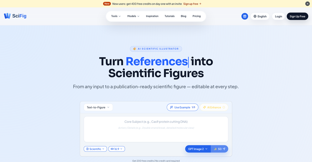
 Visualize scientific concepts with AI-generated imagery.Open
 -
 Transform text into surreal pen-and-pencil sketches with watercolor washes.Openhmmm yeah great, i'm sure i could also recreate these in real life, with pencils
 -
-
-
 Make Better Decisions with Data-Driven Charts, Clear Explanations, and Insightful AnalysisOpen
 -
-
I was just trying to get a quick graph showing population evolution over the last 30 years, didn’t have the dataset ready, so I was hoping the tool could auto-fill something reasonable. But it literally gave me three values. Three?? For 30 years?? What kind of trend can I possibly see with that? If the tool offers to research the data, it should at least offer a full timeline. And when I pasted the data I found, it created a literally bar chart???
-
-
 AI-generated Indian deity avatars blending tradition with modernity.Open
 -
-
Steer clear of this by any cost ! it gives you ONE video for free and then ask you for no less than FIFTY dollars a month for only FIVE videos ! they must be crazy with all the alternatives.
-
 AI-powered microscope for ultra-realistic nano-visuals.Open
 -
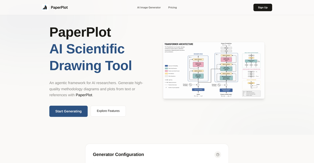
 AI-powered scientific illustration and data visualization platform.Open
 -
 Transform dream home ideas into stunning architectural visualizations.Open
 -
I really gotta let my heart out, got so many great reviews from my peers. It has helped me make my school work so much easier. I work with little children so when i make it cartoonish it's giving me the best one's yet.
-
 AI crafts realistic, family-friendly portraits of Greek deities.Open
 -
 Transform molecular visualization requests into precise PyMOL commands.Open
 -
 Turn architectural sketches into photorealistic renders in seconds.Open
 -
Dumber than a box of hair. Asked for a break even analysis chart. Fed it clear fixed costs, variable costs, net operating income AND ROI percentages. Even hinted that the break even point was between years six and seven. Dude took five minutes to draw a line across the "0" plane labeled "costs" and a revenue line crossing through where I suggested the break even point is. The scale was between 0.2-1.6 USD. No, I am not running a business for ants.
-
 Innovative visual creator with interactive idea selection.Open
 -
 Your guide to creating dynamic music visualizers!Open
 -
 Converting Python code into illustrative diagrams.OpenI like how it gives both PlantUML and Mermaid code, as I found that the Mermaid graph TD code would sometimes not work in the Mermaid Live Editor.
 -
 Expert in explaining data visuals for academic publishing.Open
 -
 Creative assistant for storyboard visualization from video briefs.Open
 -
 A software architect for C4 Model generation.Open
 -
 Get a scatter plot of keyword rankings before and after updates.Open
 -
 Technical expert on Data Visualization and database integrationOpen
 -
 Open
Open -
 Create your family constellation with DALL-E.Open
 -
 Open
Open -
 Creating visually compelling images of the future.Open
 -
 Open
Open -
 Transforming ideas into clear flowcharts with tech stack recommendations.Open
 -
-
 Create 'Fool Around/Find Out' line charts for your plans.Open
 -
 Guides in choosing the right business data visualizations.Open
 -
 Playfully creates realistic Lego Box Set images using DALL-E.Open
 -
 Open
Open -
 Creating detailed, magnified images with educational insights.Open
 -
 Open
Open -
 Automatically tile all professionals and equipment.Open
 -
 See products in a visual transition from intact to exploded views.OpenCan somebody try this tool and post a video and show how it works?
 -
 Visualize items for characters with photo-realistic images.Open
 -
 Visualizing and safeguarding your year's progress.Open


